Vincent van Gogh said of the Mediterranean: “[It] has the colour of mackerel, changeable I mean. You don’t always know if it is green or violet, you can’t even say it’s blue, because the next moment the changing reflection has taken on a tint of rose or gray”.
His comment reveals how ephemeral
colour is in the created world.
In our more regimented world we have
fewer problems with colour and so are able to assign specific meaning to
specific colours. Yet this has not always been so, and this fact affects how we
read colour in Orthodox Icons.
You will find guides to the meaning
and symbolism of colors in Orthodox Icons. I even give a couple of links at
the bottom which give excellent summaries. Here, I will only write a few brief
notes on why none of them should be considered completely definitive.
 So, like the colours on a lake’s
surface, the colours of Icons are transitory. Location, culture, the ravages of
time, availability of natural dyes, expense, and even just plain ignorance (of
symbolism in colours) all influence the colours used in Orthodox Icons.
Nevertheless, the vagaries of colour can be overemphasized, and within
Tradition there are guiding principles:
Light and Dark
 The overriding theme of colour in
iconography, and in almost every religion, is the distinction between light and
dark. This distinction is clear in the Scriptures, where the Divine is light
and illuminating, and the absence of God is considered as darkness. This
distinction is carried over into iconography and can be considered a fixed
“rule”. In icons, therefore, graves, Hades, and the demons (e.g. the demons in
the Ladder of Divine Ascent Icon) are always depicted as black, or as dark as
possible with natural pigments.
Consequently, Christ, His Angels, and
the Saints are all depicted as light and illumined. To do this, it is not
simply a case of using the colour white, as opposed to black. White is seen in
numerous Divine revelations, and is always associated with purity, and it is
this purity which affects its use in Icons. Quite simply, it is difficult to
create a white that is white enough to represent the Heavenly Glory. It is much
easier, and more impressive, to use natural light to reflect the Heavenly Light
which is even more illuminating. This is primarily done with gold.
The use of gold and other precious
materials leads on to the next principle for using colour in Icons:
Beauty
Icons must be beautiful. Whilst
standards of beauty may change from place to place, the simple piety in trying
to make Holy Images as beautiful as possible is constant. And so gold, as well
as reflecting light, is also a precious metal – which must also influence its
usage in Iconography of the Heavenly Realms. From Scripture, through the
Traditions of the Church, and even today, gold is a symbol of royalty, the sun,
and therefore of light. However, other colours can change meaning. This is why
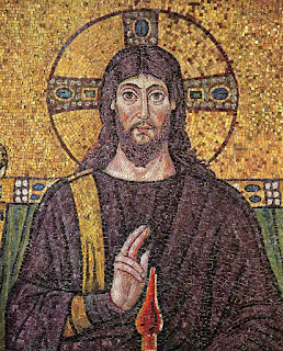
in the 6th century mosaic on the left, Christ is clothed in purple.
Tyrian purple was a colour made using
dyes made from molluscs near Phoenicia. It was extremely expensive to produce
and therefore only those of great wealth, usually nobility and sometimes only
the Emperor, could afford it or were permitted to wear it. By 400 AD, less than
half a kilo of cloth dyed with Tyrian purple, cost in excess of £12,000 in
today’s money. Given its expense, and given its exclusive association with
royalty, it becomes suddenly clear why the mosaics in Ravenna show Christ
wearing purple.
The Tradition of an Unorganized
Religion
The Icons of Pentecost show us that
the Church’s unity is not based upon being under a single, autocratic,
hierarch. Orthodoxy is not an organized religion. The Faith remains unchanged,
but people in different countries and continents differ. It is understandable,
therefore, that from place to place, the expression of “the Faith” will differ,
so that all may receive the same message in a way they can understand. What
Tyrian purple was to a 6th century Byzantine might be what gold is for us
today: a symbol of kingship. The important thing is that the kingship of Christ
is communicated.
 Iconography, like many aspects of
Orthodox practice, took hundreds of years to develop. The Truth communicated
was unchanging from the beginning, but its expression has taken time to become
established. And, again, because Orthodoxy’s Vicar of Christ on Earth is not an
incarnate human, but the invisible Holy Spirit, acting throughout the world, we
must respect and accept differences in practice. We are called to unity, rather
than uniformity. After all, even at Pentecost the Apostles are shown in robes
of many colours.
With all that in mind, I offer these
guides of on color in Orthodox Icons. They are still useful, as much of the
symbolism is taken from Scriptures, which are themselves merely intuitive
reflections on colour in nature (blue = sky/Heaven; white = clean/purity etc).
Yet the traditions of colour in Orthodox Icons are rainbow-like in their
diversity.
Source: https://iconreader.wordpress.com/2011/06/22/the-100-non-definitive-guide-to-colour-in-icons/


CONVERSATION